Windows 7: First impressions - Vista, done right
Joining the millions who brought down Microsoft servers when Windows 7 Beta went live, I booked my place in the starting lineup to get the latest and best OS to come out of Redmond thus far. Yes, there I said it, Windows 7 is the hands down, complete winner, and it has not even reached GM status. I am simply impressed by the ease, speed and the intuitive nature of the OS, after having castigated Vista for the lack of the same. Microsoft has clearly gotten its act together on this one.
The speedy setup led me to the Win7 desktop before I could scarcely even register the installation time. All my hardware was recognized immediately and the driver support seems to be top-notch! Installation of third party drivers went flawless, although I am unable to install Alcohol 120%. I ran the install through a series of stress tests including Benchmarks and file transfers, and a number of graphics intensive games. In all tests, it just seems to beat the pants off my previous install of Vista. Things, just work!
My test platform is a modest machine by all means and not a benchmarker’s dream by any stretch of the imagination. The same machine I outlined a few blog posts back. That I believe is a true test of an OS. Anyone can run Vista like a dream on C2Ds and Quad core systems with 4-8 Gigs of RAM. I am yet to find a objective review of W7 on regular Joe Six-Pack hardware specs. My search continues.
It truly seems that Microsoft has gotten it’s act back together – Windows 7 is truly what Vista should’ve been. It does seem that Microsoft needs a swift application of an appendage to the posterior to get its act together and I cite you historical facts for the same. Windows ME after Windows 98, led to the most successful consumer oriented OS release – XP. Vista after XP, will lead to Windows 7 – whether or not it will be successful, time alone shall judge, but if the beta is so good, stay tuned for the GM!
I will try and outline a few features that appealed to me during my test drive. Customary screenshots follow.

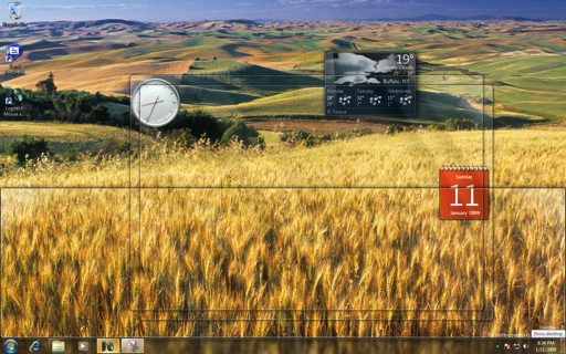
AeroPeek – on moving the mouse cursor to the bottom right, the Windows stacked on the desktop become transparent. Visual eye candy, this can be useful when trying to get to the files on the desktop. This feature seems to replace the ubiquitous "Show Desktop" on previous versions of Windows.
![]()
Taskbar – Much has been written about the new taskbar and I can corroborate, it is pretty good. It acts much like the Dock on OSX, with items that can be made "Sticky" or applications that are present while running. It automatically collates the running apps into a single icon which when hovered upon will give a live preview of the Window contents. Time saver indeed, and one step beyond OSX (in terms of preview).
![]()
Copy Progress – right on the taskbar. Not really documented on other sites, this seems to have snuck past other reviewers (or so I’d like to believe).

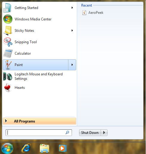
Recents – Right on the start menu, instead of having to scour through the Recents link on the start menu, which list all the recent application documents opened, this is a definite time saver.
I am indeed quite impressed.